



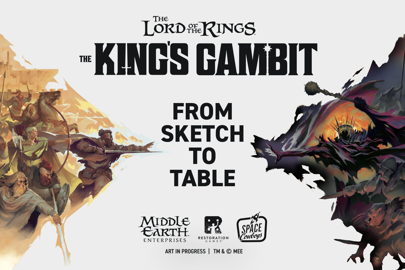
When you say Middle-earth or The Lord of the Rings, most folks will have a certain image in mind. We knew we had quite the challenge ahead of us to define the look of our game set in the epic fantasy of Tolkien’s world. So, we needed an epic team to help! Gilles-Romain Fonteny, Art Director from Space Cowboys, and Jason Taylor, our Visual Restoration Wizard, and Lindsay Daviau, our Production Superhero, partnered together to define the incredible visual world of this game.
—
What references or inspirations guided the visual direction?
Gilles: The main reference obviously is the books. We wanted to be as close as possible to Tolkien’s work, to what he wrote, to what he was able to give us in terms of details about the clothes and the physique of the characters.
Then the other thing that motivated us is to offer a modern vision of this work. When people see an Orc in this game, we didn’t just want it to be another Orc they’ve already seen in past games or past illustrations for this universe. We wanted a new vision of the characters that is faithful to Tolkien but at the same time brings something original, something a little more modern. We wanted to bring a new vision to show the fans.
What was your starting point for the artistic direction of this game?
Jason: Back when we started on this project, even back when we were first pitching this game, my mind immediately went to all of The Lord of the Rings artwork that I grew up with. From the animated series to even the concept art of the films, as well as Alan Lee and other artists. In particular I was thinking at first of a watercolor concept kind of direction to get us started. I actually commissioned Garrett Kaida to do some pieces for us to get that pitch started and send that along. Those turned out amazing, but once we got into the game and the designers started to playtest, we realized we needed something really bold for the game. So we ended up with Théo’s work which is really substantial and not quite as airy stylistically.
Lindsay: When we started thinking about the art for the game there was the binary idea of good vs evil and wanting each side to feel really different visually. If you’re playing as the Free People it’s very bright and colorful. Whereas if you’re playing as the Forces of Shadow it’s rougher and dark. We wanted it to feel immersive no matter which side you’re playing and that really informed the art direction.
Gilles: For me, the starting point is the gameplay itself because we have a game that is asymmetrical in the forces of good against the forces of Sauron. We don’t have the same troops, we don’t have the same powers. We started from this basic premise to say we want to have a different experience graphically and in the illustrations when playing the different sides. We really wanted to evoke different emotions with this asymmetrical gameplay. So when we play the good side we have an illustration style that is more realistic, more classic. When you go to the evil side you fall into a waking nightmare, into a kind of hallucinated reality. When you sit at the table on one side or the other, you feel something different. At the end of the game you want to go to the other side to try that feeling.
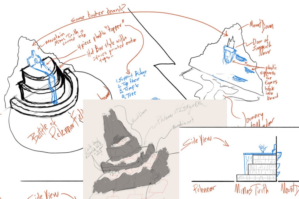
Early concept sketches
What’s the most important visual element for immersion?
Lindsay: I think in most games the most immersive element is the illustration. It connects you to the story and gets you into the feel and theme of the game quickly. Which is very true for The King’s Gambit, but this game also has the benefit of these amazing 3D elements which make you feel like you’re really there in those locations.
Jason: One way to make a game feel immersive is illustration. But I think there are a lot of other sneaky ways to get immersion into the game. Things as simple as a card back design. You want a card back design to tell you what it is, it’s the action card back. But really I want it to have a feel to it too; I want it to feel like if it’s the Servants of the Shadows card back I know I’m doing something dark and evil. These elements become not just nouns, the visual elements are the adjectives of the components if you will. They give the feeling of the world.
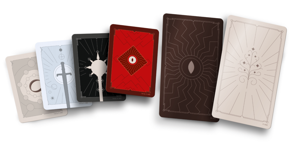
Art in progress
How do you use color, contrast, or composition to guide players?
Gilles: We tried to keep rather realistic colors for the good side. It’s the camp of light, so we have big blue skies. We have a beautiful light that comes on the characters when we play on the side of the Free People. As soon as we pass over to the side of Sauron’s forces, it is blocked horizons and intense blacks. It’s a few touches of neon too, almost bringing this hallucinatory and nightmarish side. Then for the lines, we will have harder lines on the evil side and softer, more pleasant, less aggressive lines on the good side.
In the composition we really see very far when we play the Free People, to have this idea that hope is always there. Whereas as soon as we play cards on the side of the Servants of Shadow, it’s blocked horizons and a closed in feeling. It is despair that is present in the graphic composition, in the choice of colors. It’s like having the impression that we can’t breathe, it’s kind of suffocating and that feeling comes across with Théo Guillot's illustrations. Whereas Sonderflex brings us a lot more breathing room and a lot more air for the Free People.
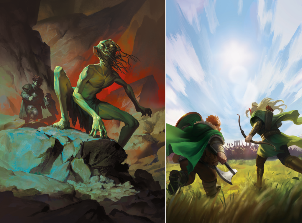
Art in progress
How do you approach creating a cohesive look across an entire game?
Jason: So there are lots of ways we can make the game cohesive throughout. One is obviously the illustration style. We get an illustrator to do art and they have their own style. That’ll carry through. But there are a lot of other ways we can do that cohesive throughline. In particular in this game we have these two sides, the Free People’s side and the Servants of the Shadow. We wanted the illustrations to have their own feel across the board but there are other details that unite them such as the color palette. We can limit the color palette and have a particular palette for the Servants of the Shadow and a different palette for the Free People, but then we can have some sympathetic colors across both of them to tie them together. Then with graphic design, border treatments, patterns, etc. we can make things feel unique to this game but also have elements that feel unique to each side. We keep threads that tie them together as a game and as a whole visual product.
What’s the journey from concept art to final plastic piece?
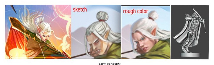
Jason: So with the miniatures, we really start with concept art. With the concept art we’re exploring sort of the soul of the character but also what are the physical elements that will make up this character and will be recognizable. For instance, for Legolas what is he wearing? We explored different directions. Was he more ragtag or more regal? What are the poses we want to see in the miniature to express action? Once those concepts come together we give that concept art to the sculptor and they will start to discover things in 3D. Then Stephen will take it from there and talk to the manufacturer about what’s possible. Sometimes Stephen will recognize right away that something won’t mold right. We’ll have to adjust some things. But it all starts with the concept art and evolves from there!
What were the elements of The Queen’s Gambit that you wanted to preserve in this restoration?
Jason: The Queen’s Gambit had table presence. That’s something that Restoration Games is no stranger to. With Fireball Island, Return to Dark Tower, that’s something we’re very well aware of dealing with. It’s something we know that when we’re restoring a game we’re not only restoring the game as it was, we’re also restoring it based on your memory of the game and the nostalgia attached to it. So a lot of times we’re competing with that memory. We have to almost outdo ourselves or outdo the other game. So we’re looking at how we can make this even more grand. So that’s what we’ve done here. We really dove into how do we make this dimensionality like was done with the palace but with the world of The Lord of the Rings? There are so many opportunities with this world and story. We had so many ideas that we had to cut back! Where do we actually focus in and where does it make sense for the game? We don’t want to be grand just for the sake of being grand. Where does it feel fun to play on these dimensional surfaces? A multi-level Minas Tirith makes a whole lot of sense. And Mount Doom. We also have some sneaky elements with extra sculpts and molds to add to the maps and world. So overall we definitely expanded upon the original for this restoration.
How does art evolve as the game develops?
Gilles: As the project goes along, you test and play and the design evolves a little at a time. Readability is always first and accessibility is always thought about. It’s at the heart of the project to have a maximum number of people who can enjoy The King’s Gambit. The graphic design iconography goes hand in hand with the illustrations to help visually communicate the gameplay. It’s all very tied together as you develop the visuals.
Art and Components in progress. TM & © MEE
—
Thanks everyone for taking us through the process of developing the visual direction for this epic game! Stay tuned for a dive into graphic design discussion and learn more about The Lord of the Rings™: The King's Gambit and back the campaign here!