
By Rob Daviau
In the summer of 1982, I played Dark Tower. It feels like a lot, but I think it was just a few intense weekends at my grandparents’ house. (They didn’t own it, but I played it there for some reason.) The feeling of wonderment never left me. I can play it now and see how it has gotten dated, but nostalgia paints a lot of things in a very pretty light. It’s interesting to restore a game that I have fond memories of. It’s sometimes hard to see what needs to change. But it does provide an emotional beacon to make sure the game “feels” right.
This game had to feel like Dark Tower even thought it was a whole new game.
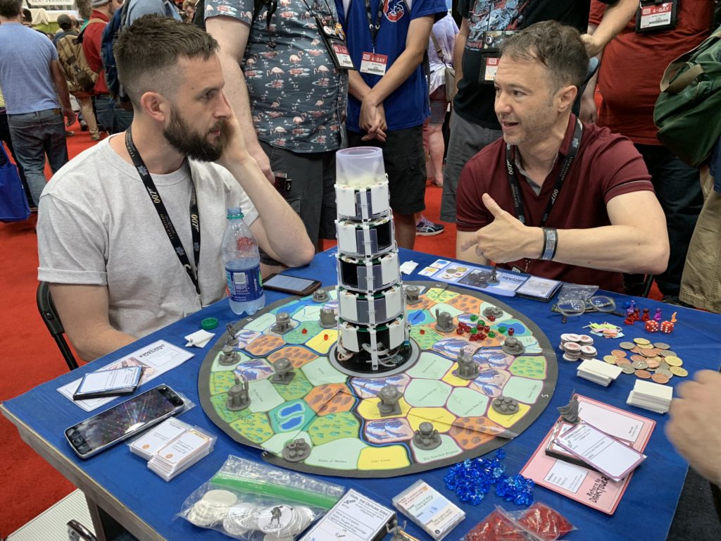
Some easy iconic reference points were essential: round board, tower in the middle, four kingdoms, four plastic buildings in each kingdom (with similar or the same names as the original), and brigands. There were secondary considerations as well: haggling, a pegasus, a dragon, a scout.
Other than that, everything was open.
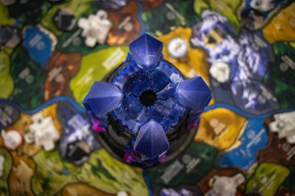
Isaac and Justin and I started this in early 2017. We spent much of that year figuring out what this should and shouldn’t be. What did the tower do? What made it cool? How did it direct or get involved with gameplay? We had a lot of ideas. The tower was going to open and you’d have the final battle inside. But then we realize that the tower was inert up until that point. It could hold a phone but, again, it did nothing and people would quickly just leave it in the box and hold the phone in their hands.
For awhile, the tower was going to rebuild itself, going from rubble to final state. Two issues with that: it did nothing but provide a show and, more importantly, it always looked like a tiered birthday cake, not a menacing tower.
At the same time, we wanted to figure out what the electronics were going to do. The original game was a breakthrough for its time. The game knew your inventory of warriors, food, and items. It knew which kingdom you we’re in. It managed combat and had events when you went into a space. What’s the 2020 equivalent to that? We knew that an app would be better than embedding code onto a chip. A hardware solution would give us 1990s technology, not 2020’s tech.
For much of 2017 we designed a game that essentially was an app game. Sometime that summer, we realized that the tower and gameboard were largely irrelevant. We didn’t want to make an app game. So we scrapped that direction. We changed our approach and said, “Pretend there’s no app; what does this game look like?”
Isaac went off and came back with a new design that formed the foundation of what we have today. It had a number of cool things that got cut over the next couple of years: five resources (not two, which is where we ended up), a dozen different buildings, the four characters that are in the game today, and a threshold battle system where you knew your losses before you went in. It was a cool game that was an engine builder and adventure game.
We started there and went through the usual design iterations. We still didn’t know what the tower did or how the app came in, but it was fall of 2017 and we were off and running.
In 2018, we spent a lot of time, off and on, pushing this forward. We had to start bringing in the other points on the triangle – app and tower – and considering what they did. This is where we had our growing tower. The app started to handle combat. Quests became big, then small, then big again. They were branching, then they were linear. We carved off two resources and reduced the number of buildings.
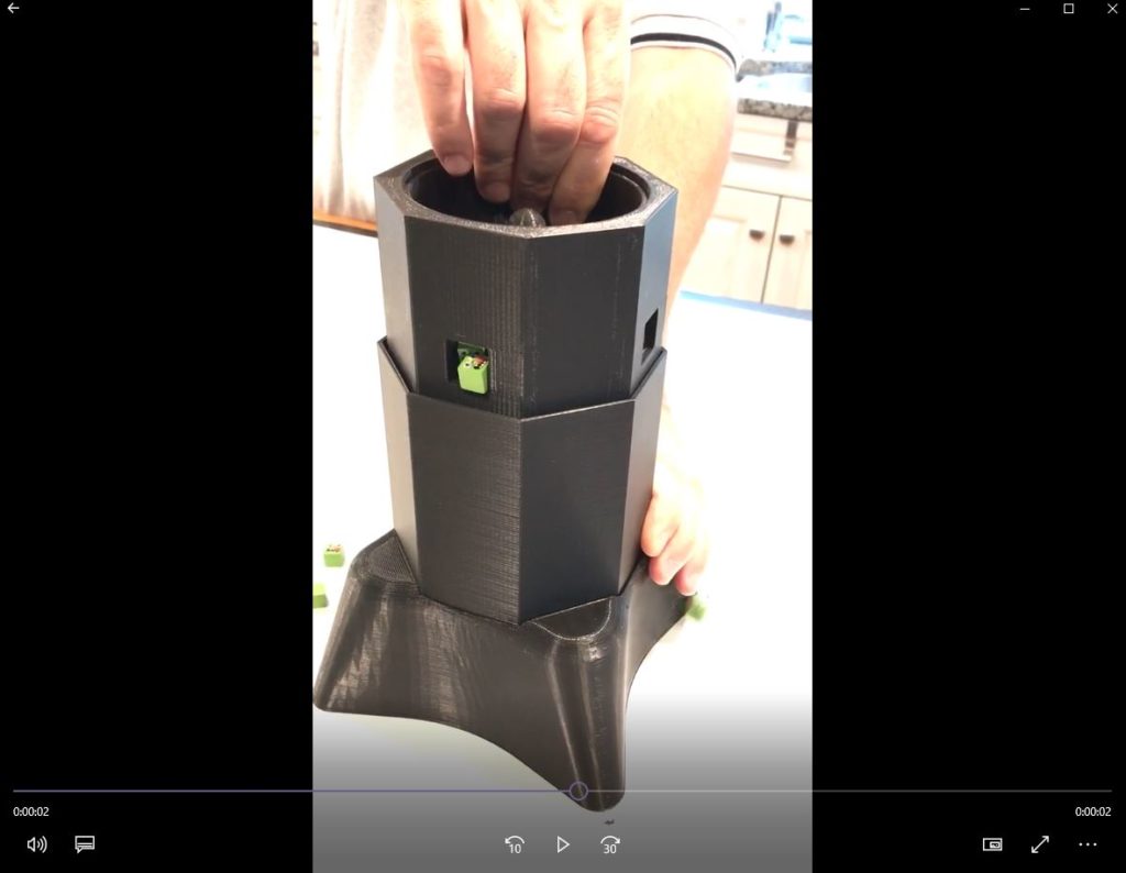
By Gen Con 2018, we had something solid enough to start thinking of who was going to build this tower. This is where Tim came in (see diary entry #2). He had a lot of ideas about tech and, from his work on Beasts of Balance, a lot of insights of how everything had to all work together as an ecosystem. We moved away from the growing tower around this point and to the version we have today. The original tower had rotating drums. So does the new one. The original had lights and sound. So did this one. Sometimes you need to travel a long way to come home again.
Turning the page to 2019, we were getting started on many fronts. We had been using pen and paper to simulate the app but we needed a proper prototyping app. We started constructing the tower. And we went into the late design/early development on the game. The team started to grow as we brought in a mechanical engineer, electrical engineer, tower master (Tim), a developer, illustrator, etc. etc. The team would only get bigger as the year went on.
2019 is a blur of design and development. We started a flurry of internal tests with an app. Since we didn’t have a tower, we built a tower simulator into the app. At Gen Con, we took a look at our first physical tower. It was working. The game was coming together.
Now it was time to cut. The tower was too big, the game took too long. We ended up trimming a level off the tower, action cards, gold, improving buildings, walls, and a dozen other little things. That part of development is always terrifying yet exhilarating.
What we have left is our polished jewel. A tower that is menacing and threatens players, an app that is dynamic and robust without taking over the game, and streamlined gameplay on the table that ties it all together. We have dynamic quests, a host of foes, and a game that challenges players to work at the edge of their heroism to keep the darkness at bay.
And the art. What until you see the art.
This is the third in a series of design diaries on Return to Dark Tower, leading up to our Kickstarter campaign, launching tomorrow, January 14th. The first diary can be found here. If you want to be notified when the campaign launches and receive a free metal active player marker, go to returntodarktower.com to sign up.